New Book: Applied ERP Data Analysis

I’m excited to announce my new book, Applied ERP Data Analysis. It’s available online FOR FREE on the LibreTexts open source textbook platform. You can cite it as: Luck, S. J. (2022). Applied Event-Related Potential Data Analysis. LibreTexts. https://doi.org/10.18115/D5QG92

The book is designed to be read online, but LibreTexts has a tool for creating a PDF. You can then print the PDF if you prefer to read on paper.

I’ve aimed the book at beginning and intermediate ERP researchers. I assume that you already know the basic concepts behind ERPs, which you can learn from my free online Intro to ERPs course (which takes 3-4 hours to complete).

Whereas my previous book focuses on conceptual issues, the new book focuses on how to implement these concepts with real data. Most of the book consists of exercises in which you process data from the ERP CORE, a set of six ERP paradigms that yield seven different components (P3b, N400, MMN, N2pc, N170, ERN, LRP). Learn by doing!

With real data, you must deal with all kinds of weird problems and make many decisions. The book will teach you principled approaches to solving these problems and making optimal decisions.

Side note: my approach in this book was inspired by Mike X Cohen’s excellent book, Analyzing Neural Time Series Data: Theory and Practice.

You will analyze the data using EEGLAB and ERPLAB, which are free open source Matlab toolboxes. Make sure to download version 9 of ERPLAB. (You may need to buy Matlab, but many institutions provide free or discounted licenses for students.) Although you will learn a lot about these specific software packages, the exercises and accompanying text are designed to teach broader concepts that will translate to any software package (and any ERP paradigm). The logic is much more important than the software!

One key element of the approach, however, is currently ERPLAB-specific. Specifically, the book frequently asks whether a given choice increases or decreases the data quality of the averaged ERPs, as quantified with the Standardized Measurement Error (SME). If this approach makes sense to you, but you prefer a different analysis package, you should encourage the developers of that package to implement SME. All our code is open source, so translating it to a different package should be straightforward. If enough people ask, they will listen!

The book also contains a chapter on scripting, plus tons of example scripts. You don’t have to write scripts for the other chapters. But learning some simple scripting will make you more productive and increase the quality, innovation, and reproducibility of your research.

I made the book free and open source so that I could give something back to the ERP community, which has given me so much over the years. But I’ve discovered two downsides to making the book free. First, there was no copy editor, so there are probably tons of typos and other errors. Please shoot me an email if you find an error. (But I can’t realistically provide tech support if you have trouble with the software.) Second, there is no marketing budget, so please spread the word to friends, colleagues, students, and billionaire philanthropists.

This book was also designed for use in undergrad and grad courses. The LibreTexts platform makes it easy for you to create a customized version of the book. You can reorder or delete sections or whole chapters. And you can add new sections or edit any of the existing text. It’s published with a CC-BY license, so you can do anything you want with it as long as you provide an attribution to the original source. And if you don’t like some of the recommendations I make in the book, you can just change it to say whatever you like! For example, you can add a chapter titled “Why Steve Luck is wrong about filtering.”

If you are a PI: the combination of the online course, this book, and the resources provided by PURSUE give you a great way to get new students started in the lab. I’m hoping this makes it easier for faculty to get more undergrads involved in ERP research. 

New Paper: Using ERPs and RSA to examine saliency maps and meaning maps for natural scenes

Kiat, J.E., Hayes, T.R., Henderson, J.M., Luck, S.J. (in press). Rapid extraction of the spatial distribution of physical saliency and semantic informativeness from natural scenes in the human brain. The Journal of Neuroscience. https://doi.org/10.1523/JNEUROSCI.0602-21.2021 [preprint]

The influence of physical salience on visual attention in real-world scenes has been extensively studied over the past few decades. Intriguingly, however, recent research has shown that semantically informative scene features often trump physical salience in predicting even the fastest eye movements in natural scene viewing. These results suggest that the brain extracts visual information that is, at the very least, predictive of the spatial distribution of potentially meaningful scene regions very rapidly.

In this new paper, Steve Luck, Taylor Hayes, John Henderson, and I sought to assess the evidence for a neural representation of the spatial distribution of meaningful features and (assuming we found such a link!) contrast the onset of its emergence relative to the onset of physical saliency. To do so, we recorded 64-channel EEG data from subjects viewing a series of real-world scene photographs while performing a modified 1-back task in which subjects were probed on 10% of trials to identify which of four scene quadrants was part of the most recently presented image (see Figure 1).

Figure 1. Stimuli and task. Subjects viewed a sequence of natural scenes. After 10% of scenes, they were probed for their memory of the immediately preceding scene.

With this dataset in hand, we next obtained spatial maps of meaning and saliency for each of the scenes. To measure the spatial distribution of meaningful features, we leveraged the “meaning maps” that had previously been obtained by the Henderson group. These maps are obtained by crowd-sourced human judgments of the meaningfulness of each patch of a given scene. The scene is first decomposed into a series of partially overlapping and tiled circular patches, and subjects rate each circular patch for informativeness (see Figure 2 and Henderson & Hayes, 2017). Then, these ratings are averaged and smoothed to produce a “meaning map,” which reflect the extent to which each location in a scene contains meaningful information. Note that these maps do not indicate the specific meanings, but simply indicate the extent to which any kind of meaningful information is present at each location.

Figure 2. Top: Example scene with corresponding saliency map and meaning map. Two areas are highlighted in blue to make it easier to see how saliency, meaningfulness, and the image correspond in these areas. Bottom: Examples of patches that were used to create the meaning maps. Observers saw individual patches, without any scene context, and rated the meaningfulness of that patch. The ratings across multiple observers for each patch were combined to create the meaning map for a given scene.

The spatial distribution of physical saliency was estimated algorithmically using the Graph-Based Visual Saliency approach (Harel et al., 2006). This algorithm extracts low-level color, orientation, and contrast feature vectors from an image using biologically inspired filters. These features are then used to compute activation maps for each feature type. Finally, these maps are normalized, additively combined, and smoothened to produce an overall “saliency map”. A few examples of meaning and saliency maps for specific scenes are shown in Figure 3. We chose this algorithm in particular because of its combination of biological plausibility and performance at matching human eye movement data.

Figure 3. Examples of images used in the study and the corresponding saliency and meaning maps. The blue regions are intended to make it easier to see correspondences between the maps and the images.

We then used the meaning maps and saliency maps to predict our ERP signals using Representational Similarity Analysis. For an overview of Representational Similarity Analysis in the context of ERPs, check out this video and this blog post.

The results are summarized in Figure 4. Not surprisingly, we found that a link between physical saliency and the ERPs emerged rapidly (ca. 78 ms after stimulus onset). The main question was how long it would take for a link to the meaning maps to be present. Would the spatial distribution of semantic informativeness take hundreds of milliseconds to develop, or would the brain rapidly determine which locations likely contained meaningful information? We found that the link between the meaning maps and the ERPs occurred extremely rapidly, less than 10 ms after the link to the saliency maps (ca. 87 ms after stimulus onset). You can see the timecourse of changes in the strength of the representational link for saliency and meaning in panel A (colored horizontal lines demark FDR corrected p < .05 timepoints) and the jackknifed mean onset latencies for the representational link of saliency and meaning in Panel B (error bars denote standard errors).

Figure 4. Primary results. A) Representational similarity between the ERP data and the saliency and meaning maps at each time point, averaged over participants. Each waveform shows the unique variance explained by each map type. B) Onset latencies from the representational similarity waveforms for saliency and meaning. The onset was only slightly later for the meaning maps than for the saliency maps.

Note that the waveforms show semipartial correlations (i.e., the unique contribution of one type of map when variance due to the other type is factored out). These findings therefore show that meaning maps have a unique neurophysiological basis from saliency.

The rapid time course of the meaning map waveform also indicates that information related to the locations containing potentially meaningful information is computed rapidly, early enough to influence even the earliest eye movements. This is a correlation-based approach, so these results do not indicate that meaning per se is calculated by 87 ms. However, the results indicate that information that predicts the locations of meaningful scene elements is computed by 87 ms. Presumably, this information would be useful for directing shifts of covert and/or overt attention that would in turn allow the actual meanings to be computed.

The data and code are available at https://osf.io/zg7ue/. Please feel free to use this code and dataset (high-density ERP averages for 50 real-world scenes from 32 subjects) to explore research questions that interest you!

Postdoc position available in the Luck lab

A postdoc position focused on ERP methods development and ERPLAB Toolbox is available in the laboratory of Steve Luck at the UC-Davis Center for Mind & Brain. Both U.S. and international applicants are welcome. Multiple years of funding are possible. Our lab places significant emphasis on postdoctoral training, and we have an excellent track record of placing our postdocs in faculty and industry positions. The position is available immediately, but we are prepared to wait up to 6 months for the right applicant.

Our lab is deeply involved in using, developing, and promoting EEG/ERP methods. In addition to using ERPs in both basic science and clinical research, our lab produces ERPLAB Toolbox, a Matlab-based ERP data analysis package that plugs into the EEGLAB package. ERPLAB has been downloaded >50,000 times and has been used in >2000 published papers. Our lab also runs the ERP Boot Camp, a yearly summer workshop on ERP methods, and we have conducted several large online webinars focused on multivariate pattern analysis and other advanced methods. We have also recently released a large dataset, the ERP CORE, and a new metric of data quality for averaged ERPs called the Standardized Measurement Error. We are also currently developing multivariate pattern analysis methods for EEG/ERP data. Our overall goal is to promote best practices in ERP research so that this method can have the maximum impact in research on the mind and brain.

We are seeking someone to take over the major programming responsibilities for ERPLAB Toolbox and to contribute to the conceptualization and design of the package as it continues to evolve. Plans for the next several years include a new graphical user interface, the addition of multivariate pattern analysis routines, and the addition of an EEG simulation module. We also plan to improve and expand our new metric of data quality and our methods for multivariate pattern analysis of EEG/ERP data. There will also be opportunities for involvement in the various EEG/ERP research and training activities in our laboratory, including our basic science research on visual cognition and our clinical research on schizophrenia. This is a great position for someone with interests in developing/implementing new methods and improving the quality of ERP research broadly for the field.

Required qualifications include a PhD in Psychology, Neuroscience, or related field; excellent English language communication skills; substantial research experience with ERPs; and extensive Matlab programming experience. Preferred qualifications include extensive experience with EEGLAB and/or ERPLAB. Salary will depend on experience, with a minimum set by the University of California postdoc salary scale (which is higher than NIH scale). We will begin accepting applications immediately, and the position will close once a suitable candidate is identified, so it is recommended that you apply soon. We are aiming for a start date between July 15, 2021 and January 1, 2022.

Davis is a vibrant college town in Northern California, located approximately 20 minutes from Sacramento, 75 minutes from San Francisco, 45 minutes from Napa, and 2 hours from Lake Tahoe.  The Center for Mind & Brain is an interdisciplinary and collaborative research center devoted to cognitive science and cognitive neuroscience, located in a beautiful building with state-of-the-art laboratories.

To apply, send a cover letter describing your background and interests, a CV, and at least one letter of recommendation to Aaron Simmons (lucklab.manager@gmail.com). UC Davis is a diverse community that welcomes individuals from underrepresented and disadvantaged groups, and all applicants are encouraged (but not required) to include a statement of contributions to diversity with their materials.


New fMRI evidence for hyperfocusing in schizophrenia

Hahn, B., Bae, G.-Y., Robinson, B. M., Leonard, C. J., Luck, S. J., & Gold, J. M. (2020). Cortical hyperactivation at low working memory load: A primary processing abnormality in people with schizophrenia? NeuroImage: Clinical, 26, 102270. https://doi.org/10.1016/j.nicl.2020.102270

The hyperfocusing hypothesis proposes that schizophrenia involves an abnormally narrow but intense focusing of processing resources. That is, people with schizophrenia are not impaired at focusing their attention; on the contrary, they tend to focus their attention more intensely and more narrowly compared to healthy control subjects. I wrote a blog post about this hypothesis last September (when we published a couple review papers). Today, I’d like to describe evidence from a new fMRI study of visual working memory—led by Britta Hahn—that was recently published in NeuroImage: Clinical (open access!).

The bottom line: When we compared groups of people with schizophrenia (PSZ) and healthy control subjects (HCS) who were matched for behavioral performance, PSZ exhibited greater BOLD activation than HCS when required to maintain a single object in working memory. This is exactly what we mean by a “more intense” focusing of processing resources in PSZ.

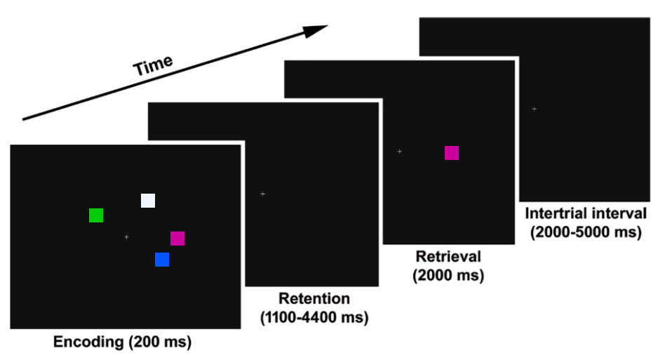
Now for the details. As shown in the diagram, subjects performed a change detection task. On each trial, subjects were shown an Encoding Array consisting of 1–7 colored squares, which they were required to maintain in working memory over a delay period. Then, a colored square was shown at one of the original locations, and subjects had to indicate whether this was the same color as the square that had been present at that location in the Encoding Array. Tons of previous research has shown that this task is an excellent measure of working memory capacity (reviewed here).

SZ fMRI VWM Stimuli.jpg

Previous fMRI research by Todd & Marois (2004, 2005) has shown that the posterior parietal cortex (PPC) plays a key role in this task: BOLD activity in PPC increases as the number of items maintained in WM increases. Because this task does not involve significant manipulation or interference, the PFC does not appear to play much role. Just like Todd & Marois, we found an area of the PPC in which the BOLD signal varied across set size in a manner that matched the number of objects that were stored in memory (as measured behaviorally). This result was previously published, along with evidence that PSZ exhibited greater BOLD activity than HCS at set size 1 (consistent with hyperfocusing). This is consistent with a previous ERP study led by Carly Leonard, in which we found greater delay-period activity in PSZ than in HCS at set size 1.

However, it can be problematic to compare fMRI data across patients and controls when they also differ in performance. For example, if PSZ have decreased working memory capacity, then this may cause them to exert more effort at low set sizes, so the greater BOLD activity at set size 1 in PSZ relative to HCS could be a side effect of lower working memory capacity in PSZ. In our previous ERP study, we addressed this by comparing subsets of PSZ and HCS who were matched on behaviorally measured working memory capacity (K). Our new fMRI paper took this same approach. We ended up with subgroups of 23 PSZ and 23 HCS (from an original sample of 37 PSZ and 37 HCS) that were very well matched on behavioral performance.

SZ fMRI VWM Figure3.jpg

The results are summarized in the figure. You can see the area of posterior parietal cortex that was related to working memory capacity, the BOLD signal at each set size in the full groups (A), and the BOLD signal at each set size in the matched subgroups (B). Whether or not we matched performance, the BOLD signal was much larger in PSZ than in HCS at set size 1, consistent with “an abnormally narrow but intense focusing of processing resources” in schizophrenia.

New papers on the hyperfocusing hypothesis of cognitive dysfunction in schizophrenia

Luck, S. J., Hahn, B., Leonard, C. J., & Gold, J. M. (2019). The hyperfocusing hypothesis: A new account of cognitive dysfunction in schizophrenia. Schizophrenia Bulletin, 45, 991–1000. https://doi.org/10.1093/schbul/sbz063

Luck, S. J., Leonard, C. J., Hahn, B., & Gold, J. M. (2019). Is selective attention impaired in schizophrenia? Schizophrenia Bulletin, 45, 1001–1011. https://doi.org/10.1093/schbul/sbz045

The most distinctive symptoms of schizophrenia are hallucinations, delusions, and disordered thought/behavior. However, people with schizophrenia also typically have impairments in basic cognitive processes, such as attention and working memory, and the degree of cognitive dysfunction is a better predictor of long-term outcome than is the severity of the psychotic symptoms.

Researchers have tried to identify the nature of cognitive dysfunction in schizophrenia since the 1960s, and our collaborative research group has spent almost 20 years on this problem. We now have a well-supported theory, which we call the hyperfocusing hypothesis, and we recently published a pair of papers that review this theory. The first paper describes the hyperfocusing hypothesis in detail and reviews the evidence for it, and the second paper contrasts it with the traditional idea that schizophrenia involves impaired filtering.

The hyperfocusing hypothesis proposes that schizophrenia involves an abnormally narrow but intense focusing of processing resources. That is, people with schizophrenia are not impaired at focusing their attention; on the contrary, they tend to focus their attention more intensely and more narrowly compared to healthy control subjects. This hypothesis can explain findings from several different cognitive domains, including reductions in working memory capacity (because people with schizophrenia have difficulty dividing resources among multiple memory representations), deficits in experimental paradigms that involve spreading attention broadly (such as the Useful Field of View task), and abnormal capture of attention by irrelevant stimuli that share features with active representations. In addition to explaining many previous findings, the hyperfocusing hypothesis has also led to many new predictions that have been tested and verified. We also find that the degree of hyperfocusing is often correlated with the degree of impairment in measures of broad cognitive function, which are known to be related to long-term outcome.

When a psychiatric group exhibits impaired performance relative to a control group, there are usually many possible explanations (e.g., reduced motivation, impaired task comprehension). However, the hyperfocusing hypothesis proposes that people with schizophrenia focus more strongly than control subjects, which leads to the counterintuitive prediction that people with schizophrenia will exhibit supranormal focusing of processing resources under some conditions. And this is exactly what we have found in several experiments. For example, in both ERP and fMRI studies, we have found that delay-period activity is enhanced in people with schizophrenia relative to control subjects when only a single object is being maintained. This is an example of what we mean by a “more intense” focusing of processing resources. You might be concerned that people with schizophrenia exert greater effort to achieve the same memory performance, and this leads to greater delay-period activity. However, when we examine subgroups that are matched on behavioral measures of working memory capacity, we still find that people with schizophrenia exhibit enhanced activity relative to control subjects when a single item is being remembered.

Classically, schizophrenia has been thought to involve an impairment in selective attention, a “broken filter.” For example, one individual wrote the following in an online forum: “Ever since I started having problems due to schizophrenia, my senses have been thrown out of whack... I remember one day when I got caught in the rain. Each drop felt like an electric shock and I found it hard to move because of how intense and painful the feeling was.” How can we reconcile this evidence for increased distraction with the idea that schizophrenia involves hyperfocusing? The most likely rapprochement between the hyperfocusing hypothesis and the broken filter hypothesis is that schizophrenia also involves impaired executive control, so people with schizophrenia often point their “spotlight” of attention in the wrong direction. As a result, they may focus narrowly and intensely on inputs that would ordinarily be ignored (e.g., drops of rain), producing greater distractibility even though the filtering mechanism itself is operating very intensely.

New ERP Decoding Paper: Reactivation of Previous Experiences in a Working Memory Task

Bae, G.-Y., & Luck, S. J. (in press). Reactivation of Previous Experiences in a Working Memory Task. Psychological Sciencehttps://doi.org/10.1177/0956797619830398

Gi-Yeul Bae and I have previously shown that the ERP scalp distribution can be used to decode which of 16 orientations is currently being stored in visual working memory (VWM). In this new paper, we reanalyze those data and show that we can also decode the orientation of the stimulus from the previous trial. It’s amazing that this much information is present in the pattern of voltage on the surface of the scalp!

Here’s the scientific background: There are many ways in which previously presented information can automatically impact our current cognitive processing and behavior (e.g., semantic priming, perceptual priming, negative priming, proactive interference). An example of this that has received considerable attention recently is the serial dependence effect in visual perception (see, e.g., Fischer & Whitney, 2014). When observers perform a perceptual task on a series of trials, the reported target value on one trial is biased by the target value from the preceding trial. 

We also find this trial-to-trial dependency in visual working memory experiments: The reported orientation on one trial is biased away from the stimulus orientation on the previous trial. On each trial (see figure below), subjects see an oriented teardrop and, after a brief delay, report the remembered orientation by adjusting a new teardrop to match the original teardrop’s orientation. Each trial is independent, and yet the reported orientation on one trial (indicated by the blue circle in the figure) is biased away from the orientation on the previous trial (indicated by the red circle in the figure; note that the circles were not actually colored in the actual experiment). 

N-1-Decoding--Stimuli.jpg

These effects imply that a memory is stored of the previous-trial target, and this memory impacts the processing of the target on the current trial. But what is the nature of this memory?

We considered three possibilities: 1) An active representation from the previous trial is still present on the current trial; 2) The representation from the previous trial is stored in some kind of “activity-silent” synaptic form that influences the flow of information on the current trial; and 3) An activity-silent representation of the previous trial is reactivated when the current trial begins. We found evidence in favor of this third possibility by decoding the previous-trial orientation from the current-trial scalp ERP. That is, we used the ERP scalp distribution at each time point on the current trial to “predict” the orientation on the previous trial.

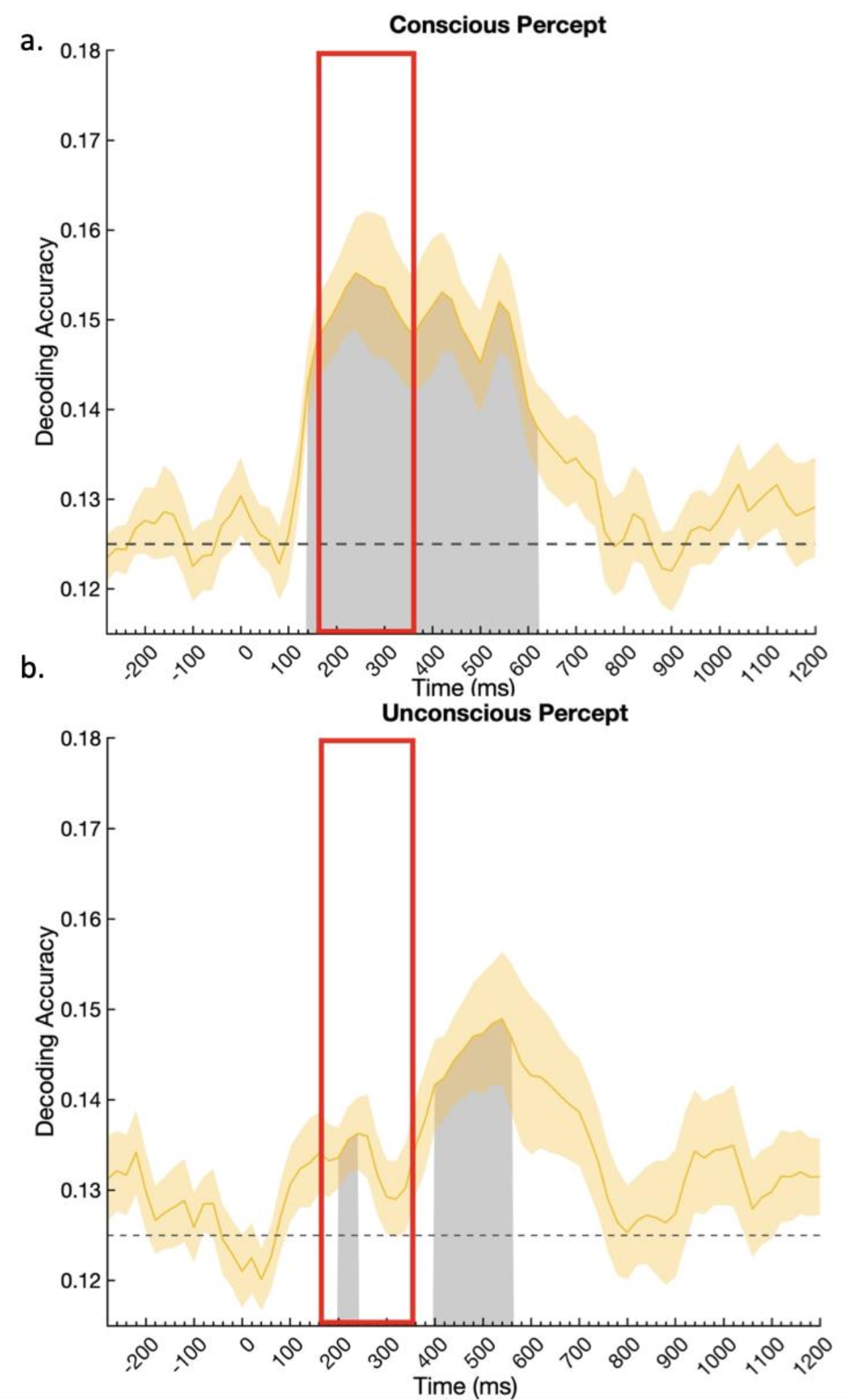
This previous-trial decoding is shown for two separate experiments in the figure below. Time zero represents the onset of the sample stimulus on the current trial. In both experiments, we could decode the orientation from the previous trial in the period following the onset of the current-trial sample stimulus (gray regions are statistically significant after controlling for multiple comparisons; chance = 1/16). 

N-1-Decoding--Results.jpg

These results indicate that a representation of the previous-trial orientation was activated (and therefore decodable) by the onset of the current-trial stimulus. We can’t prove that this reactivation was actually responsible for the behavioral priming effect, but this at least establishes the plausibility of reactivation as a mechanism of priming (as hypothesized many years ago by Gordon Logan).

This study also demonstrates the power of applying decoding methods to ERP data. These methods allow us to track the information that is currently being represented by the brain, and they have amazing sensitivity to quite subtle effects. Frankly, I was quite surprised when Gi-Yeul first showed me that he could decode the orientation of the previous-trial target. And I wouldn’t have believed it if he hadn’t shown that he replicated the result in an independent set of data.

Gi-Yeul has made the data and code available at https://osf.io/dbgh6/. Please take his code and apply it to your own data!

Why experimentalists should ignore reliability and focus on precision

It is commonly said that “a measure cannot be valid if it is not reliable.” It turns out that this is simply false (as long as we define these terms in the traditional way). And it also turns out that, although reliability is extremely important in some types of research (e.g., correlational studies of individual differences), it’s the wrong way to think about data quality when you are comparing groups or conditions (e.g., using t tests or ANOVAs).

I’ve been thinking about this issue for several years in the context of ERP data quality (leading to this paper). It turns out that ordinary measures of reliability are quite unsatisfactory for assessing whether ERP data are noisy. This is also true for reaction time (RT) data. A couple days ago, Michaela DeBolt (@MDeBoltC) alerted me to a new paper by Hedge et al. (2018) showing that typical measures of reliability can be low even when power is high in experimental studies. There’s also a recent paper on MRI data quality by Brandmaier et al. (2018) that includes a great discussion of how the term “reliability” is used to mean different things in different fields.

Here’s a quick summary of the main issue: Psychologists usually quantify reliability using correlation-based measures such as Cronbach’s alpha. Because the magnitude of a correlation depends on the amount of true variability among participants, these measures of reliability can go up or down a lot depending on how homogeneous or heterogeneous the population is. All else being equal, a correlation will be higher if the participants are more heterogeneous. Thus, reliability (as typically quantified by psychologists) depends on the range of values in the population being tested as well as the nature of the measure. That’s like a physicist saying that the reliability of a thermometer depends on whether it is being used in Chicago (where summers are hot and winters are cold) or in San Diego (where the temperature hovers around 72°F all year long).

Moreover, increasing the variability across subjects reduces your effect sizes and statistical power when you are comparing groups or conditions. All else being equal, increasing the heterogeneity of your population will simultaneously increase your reliability (and your statistical power for detecting correlations between variables) and decrease the statistical power of your t tests and ANOVAs. If you want to quantify your data quality in a way that is related to effect sizes and statistical power for t tests and ANOVAs, you should use a measure of precision (as defined later).

One might argue that this is not really what psychometricians mean when they’re talking about reliability (see Li, 2003, who effectively redefines the term “reliability” to capture what I will be calling “precision”). However, the way I will use the term “reliability” captures the way this term has been operationalized in 100% of the papers I have read that have quantified reliability (and in the classic texts on psychometrics cited by Li, 2003).

A Simple Reaction Time Example

Let’s look at this in the context of a simple reaction time experiment. Imagine that two researchers, Dr. Careful and Dr. Sloppy, use exactly the same task to measure mean RT (averaged over 50 trials) from each person in a sample of 100 participants (drawn from the same population). However, Dr. Careful is meticulous about reducing sources of extraneous variability, and every participant is tested by an experienced research assistant at the same time of day (after a good night’s sleep) and at the same time since their last meal. In contrast, Dr. Sloppy doesn’t worry about these sources of variance, and the participants are tested by different research assistants at different times of day, with no effort to control sleepiness or hunger. The measures should be more reliable for Dr. Careful than for Dr. Sloppy, right? Wrong! Reliability (as typically measured by psychologists) will actually be higher for Dr. Sloppy than for Dr. Careful (assuming that Dr. Sloppy hasn’t also increased the trial-to-trial variability of RT).

To understand why this is true, let’s take a look at how reliability would typically be measured in a study like this. One common way to quantify the reliability of the RT measure is the split-half reliability. (There are better measures of reliability for this situation, but they all lead to the same problem, and split-half reliability is easy to explain.) To compute the split-half reliability, the researchers divide the trials for each participant into odd-numbered and even-numbered trials, and they calculate the mean RT separately for the odd- and even-numbered trials. This gives them two values for each participant, and they simply compute the correlation between these two values. The logic is that, if the measure is reliable, then the mean RT for the odd-numbered trials should be pretty similar to the mean RT for the even-numbered trials in a given participant, so individuals with a fast mean RT for the odd-numbered trials should also have a fast mean RT for the even-numbered trials, leading to a high correlation. If the measure is unreliable, however, the mean RTs for the odd- and even-numbered trials will often be quite different for a given participant, leading to a low correlation.

However, correlations are also impacted by the range of scores, and the correlation between the mean RT for the odd- versus even-numbered trials will end up being greater for Dr. Sloppy than for Dr. Careful because the range of mean RTs is greater for Dr. Sloppy (e.g., because some of Dr. Sloppy’s participants are sleepy and others are not). This is illustrated in the scatterplots below, which show simulations of the two experiments. The experiments are identical in terms of the precision of the mean RT measure (i.e., the trial-to-trial variability in RT for a given participant). The only thing that differs between the two simulations is the range of true mean RTs (i.e., the mean RT that a given participant would have if there were no trial-by-trial variation in RT). Because all of Dr. Careful’s participants have mean RTs that cluster closely around 500 ms, the correlation between the mean RTs for the odd- and even-numbered trials is not very high (r=.587). By contrast, because some of Dr. Sloppy’s participants are fast and others are slow, the correlation is quite good (r=.969). Thus, simply by allowing the testing conditions to vary more across participants, Dr. Sloppy can report a higher level of reliability than Dr. Careful.

Keep in mind that Dr. Careful and Dr. Sloppy are measuring mean RT in exactly the same way. The actual measure is identical in their studies, and yet the measured reliability differs dramatically across the studies because of the differences in the range of scores. Worse yet, the sloppy researcher ends up being able to report higher reliability than the careful researcher.

Let’s consider an even more extreme example, in which the population is so homogeneous that every participant would have the same mean RT if we averaged together enough trials, and any differences across participants in observed mean RT are entirely a result of random variation in single-trial RTs. In this situation, the split-half reliability would have an expected value of zero. Does this mean that mean RT is no longer a valid measure of processing speed? Of course not—our measure of processing speed is exactly the same in this extreme case as in the studies of Dr. Careful and Dr. Sloppy. Thus, a measure can be valid even if it is completely unreliable (as typically quantified by psychologists).

Here’s another instructive example. Imagine that Dr. Careful does two studies, one with a population of college students at an elite university (who are relatively homogeneous in age, education, SES, etc.) and one with a nationally representative population of U.S. adults (who vary considerably in age, education, SES, etc.). The range of mean RT values will be much greater in the nationally representative population than in the college student population. Consequently, even if Dr. Careful runs the study in exactly the same way in both populations, the reliability will likely be much greater in the nationally representative population than in the college student population. Thus, reliability (as typically measured by psychologists) depends on the range of scores in the population being measured and not just on the properties of the measure itself. This is like saying that a thermometer is more reliable in Chicago than in San Diego simply because the range of temperatures is greater in Chicago.

Example of an Experimental Manipulation

Flankers.jpg

Now let’s imagine that Dr. Careful and Dr. Sloppy don’t just measure mean RT in a single condition, but they instead test the effects of a within-subjects experimental manipulation. Let’s make this concrete by imagining that they conduct a flankers experiment, in which participants report whether a central arrow points left or right while ignoring flanking stimuli that are either compatible or incompatible with the central stimulus (see figure). In a typical study, mean RT would be slowed on the incompatible trials relative to the compatible trials (a compatibility effect).

If we look at the mean RTs in a given condition of this experiment, we will see that the mean RT varies from participant to participant much more in Dr. Sloppy’s version of the experiment than in Dr. Careful’s version (because there is more variation in factors like sleepiness in Dr. Sloppy’s version). Thus, as in our original example, the split-half reliability of the mean RT for a given condition will again be higher for Dr. Sloppy than for Dr. Careful. But what about the split-half reliability of the flanker compatibility effect? We can quantify the compatibility effect as the difference in mean RT between the compatible and incompatible trials for a given participant, averaged across left-response and right-response trials. (Yes, there are better ways to analyze these data, but they all lead to the same conclusions about reliability.) We can compute the split-half reliability of the compatibility effect by computing it twice for every subject—once for the odd-numbered trials and once for the even-numbered trials—and calculating the correlation between these values.

The compatibility effect, like the raw RT, is likely to vary according to factors like the time of day, so the range of compatibility effects will be greater for Dr. Sloppy than for Dr. Careful. And this means that the split-half reliability will again be greater for Dr. Sloppy than for Dr. Careful. (Here I am assuming that trial-to-trial variability in RT is not impacted by the compatibility manipulation and by the time of day, which might not be true, but nonetheless it is likely that the reliability will be at least as high for Dr. Sloppy as for Dr. Careful.)

By contrast, statistical power for determining whether a compatibility effect is present will be greater for Dr. Careful than for Dr. Sloppy. In other words, if we use a one-sample t test to compare the mean compatibility effect against zero, the greater variability of this effect in Dr. Sloppy’s experiment will reduce the power to determine whether a compatibility effect is present. So, even though reliability is greater for Dr. Sloppy than for Dr. Careful, statistical power for detecting an experimental effect is greater for Dr. Careful than for Dr. Sloppy. If you care about statistical power for experimental effects, reliability is probably not the best way for you to quantify data quality.

Example of Individual Differences

What if Dr. Careful and Dr. Sloppy wanted to look at individual differences? For example, imagine that they were testing the hypothesis that the flanker compatibility effect is related to working memory capacity. Let’s assume that they measure both variables in a single session. Assuming that both working memory capacity and the compatibility effect vary as a function of factors like time of day, Dr. Sloppy will find greater reliability for both working memory capacity and the compatibility effect (because the range of values is greater for both variables in Dr. Sloppy’s study than in Dr. Careful’s study). Moreover, the correlation between working memory capacity and the compatibility effect will be higher in Dr. Sloppy’s study than in Dr. Careful’s study (again because of differences in the range of scores).

In this case, greater reliability is associated with stronger correlations, just as the psychometricians have always told us. All else being equal, the researcher who has greater reliability for the individual measures (Dr. Sloppy in this example) will find a greater correlation between them. So, if you want to look at correlations between measures, you want to maximize the range of scores (which will in turn maximize your reliability). However, recall that Dr. Careful had more statistical power than Dr. Sloppy for detecting the compatibility effect. Thus, the same factors that increase reliability and correlations between measures can end up reducing statistical power when you are examining experimental effects with exactly the same measures. (Also, if you want to look at correlations between RT and other measures, I recommend that you read Miller & Ulrich, 2013, which shows that these correlations are more difficult to interpret than you might think.)

It’s also important to note that Dr. Sloppy would run into trouble if we looked at test-retest reliability instead of split-half reliability. That is, imagine that Dr. Sloppy and Dr. Careful run studies in which each participant is tested on two different days. Dr. Careful makes sure that all of the testing conditions (e.g., time of day) are the same for every participant, but Dr. Sloppy isn’t careful to keep the testing conditions constant between the two session for each participant. The test-retest reliability (the correlation between the measure on Day 1 and Day 2) would be low for Dr. Sloppy. Interestingly, Dr. Sloppy would have high split-half reliability (because of the broad range of scores) but poor test-retest reliability. Dr. Sloppy would also have trouble if the compatibility effect and working memory capacity were measured on different days. However, both split-half reliability and test-retest reliability would be better in a broad nationally representative sample than in a sample of relatively homogeneous college students, so the general point about reliability and heterogeneity is true for any correlation-based measure of reliability.

Precision vs. Reliability

Now let’s turn to the distinction between reliability and precision. The first part of the Brandmaier et al. (2018) paper has an excellent discussion of how the term “reliability” is used differently across fields. In general, everyone agrees that a measure is reliable to the extent that you get the same thing every time you measure it. The difference across fields lies in how reliability is quantified. When we think about reliability in this way, a simple way to quantify it would be to obtain the measure a large number of times under identical conditions and compute the standard deviation (SD) of the measurements. The SD is a completely straightforward measure of the “the extent that you get the same thing every time you measure it.” For example, you could use a balance to weigh an object 100 times, and the standard deviation of the weights would indicate the reliability of the balance. Another term for this would be the “precision” of the balance, and I will use the term “precision” to refer to the SD over multiple measurements. (In physics, the SD is typically divided by the mean to get the coefficient of variability, which is often a better way to quantify reliability for measures like weight that are on a ratio scale.)

The figure below (from the Brandmaier article) shows what is meant by low and high precision in this context, and you can see how the SD would be a good measure of precision. The key is that precision reflects the variability of the measure around its mean, not whether the mean is the true mean (which would be the accuracy or bias of the measure).

From Brandmaier et al. (2018)

From Brandmaier et al. (2018)

Things are more complicated in most psychology experiments, where there are (at least) two distinct sources of variability in a given experiment: true differences among participants (called the true score variance) and measurement imprecision. However, in a typical experiment, it is not obvious how to separately quantify the true score variance from the measurement imprecision. For example, if you measure a dependent variable once from N participants, and you look at the variance of those values, the result will be the sum of the true score variance and the variance due to measurement error. These two sources of variance are mixed together, and you don’t know how much of the variance is a result of measurement imprecision.

Imagine, however, that you’ve measured the dependent variable twice from each subject. Now you could ask how close the two measures are to each other. For example, if we take our original simple RT experiment, we could get the mean RT from the odd-number trials and the mean RT from the even-numbered trials in each participant. If these two scores were very close to each other in each participant, then we would say we have a precise measure of mean RT. For example, if we collected 2000 trials from each participant, resulting in 1000 odd-numbered trials and 1000 even-numbered trials, we’d probably find that the two mean RTs for a given subject were almost always within 10 ms of each other. However, if collected only 20 trials from each participant, we would see big differences between the mean RTs from the odd- and even-numbered trials. This makes sense: All else being equal, mean RT should be a more precise measure if it’s based on more trials.

In a general sense, we’d like to say that mean RT is a more reliable measure when it’s based on more trials. However, as the first part of this blog post demonstrated, typical psychometric approaches to quantifying reliability are also impacted by the range of values in the population and not just the precision of the measure itself: Dr. Sloppy and Dr. Careful were measuring mean RT with equal precision, but split-half reliability was greater for Dr. Sloppy than for Dr. Careful because there was a greater range of mean RT values in Dr. Sloppy’s study. This is because split-half reliability does not look directly at how similar the mean RTs are for the odd- and even-numbered trials; instead, it involves computing the correlation between these values, which in turn depends on the range of values across participants.

How, then, can we formally quantify precision in a way that does not depend on the range of values across participants? If we simply took the difference in mean RT between the odd- and even-numbered trials, this score would be positive for some participants and negative for others. As a result, we can’t just average this difference across participants. We could take the absolute value of the difference for each participant and then average across participants, but absolute values are problematic in other ways. Instead, we could just take the standard deviation (SD) of the two scores for each person. For example, if Participant #1 had a mean RT of 515 ms for the odd-numbered trials and a mean RT of 525 ms for the even-numbered trials, the SD for this participant would be 7.07 ms. SD values are always positive, so we could average the single-participant SD values across participants, and this would give us an aggregate measure of the precision of our RT measure.

The average of the single-participant SDs would be a pretty good measure of precision, but it would underestimate the actual precision of our mean RT measure. Ultimately, we’re interested in the precision of the mean RT for all of the trials, not the mean RT separately for the odd- and even-numbered trials. By cutting the number of trials in half to get separate mean RTs for the odd- and even-numbered trials, we get an artificially low estimate of precision.

Fortunately, there is a very familiar statistic that allows you to quantify the precision of the mean RT using all of the trials instead of dividing them into two halves. Specifically, you can simply take all of the single-trial RTs for a given participant in a given condition and compute the standard error of the mean (SEM). This SEM tells you what you would expect to find if you computed the mean RT for that subject in each of an infinite number of sessions and then took the SD of the mean RT values.

Let’s unpack that. Imagine that you brought a single participant to the lab 1000 times, and each time you ran 50 trials and took the mean RT of those 50 trials. (We’re imagining that the subject’s performance doesn’t change over repeated sessions; that’s not realistic, of course, but this is a thought experiment so it’s OK.) Now you have 1000 mean RTs (each based on the average of 50 trials). You could take the SD of those 1000 mean RTs, and that would be an accurate way of quantifying the precision of the mean RT measure. It would be just like a chemist who weighs a given object 1000 times on a balance and then uses the SD of these 1000 measurements to quantify the precision of the balance.

But you don’t actually need to bring the participant to the lab 1000 times to estimate the SD. If you compute the SEM of the 50 single-trial RTs in one session, this is actually an estimate of what would happen if you measured mean RT in an infinite number of sessions and then computed the SD of the mean RTs. In other words, the SEM of the single-trial RTs in one session is an estimate of the SD of the mean RT across an infinite number of sessions. (Technical note: It would be necessary to deal with the autocorrelation of RT across trials, but there are methods for that.)

Thus, you can use the SEM of the single-trial RTs in a given session as a measure of the precision of the mean RT measure for that session. This gives you a measure of the precision for each individual participant, and you can then just average these values across participants. Unlike traditional measures of reliability, this measure of precision is completely independent of the range of values across the population. If Dr. Careful and Dr. Sloppy used this measure of precision, they would get exactly the same value (because they’re using exactly the same procedure to measure mean RT in a given participant). Moreover, this measure of precision is directly related to the statistical power for detecting differences between conditions (although there is a trick for aggregating the SEM values across participants, as is detailed in our paper on ERP data quality).

So, if you want to assess the quality of your data in an experimental study, you should compute the SEM of the single-trial values for each subject, not some traditional measure of “reliability.” Reliability is very important for correlational studies, but it’s not the right measure of data quality in experimental studies.

Here’s the bottom line: the idea that “a measure cannot be valid if it is not reliable” is not true for experimentalists (given how reliability is typically operationalized by psychologists), and they should focus on precision rather than reliability.

Contra-freeloading: Something that every psychologist, neuroscientist, economist, and policymaker should know about

Why do people work?  For the money, obviously.  That’s a fundamental part of how most people think about economics.

Why do rats and monkeys press levers in experiments on reinforcement learning? Because pressing the lever produces food or water, obviously. That’s a fundamental part of how most psychologists and neuroscientists think about reinforcement learning.

If people or animals could get money/food without working for it, they would never work. In other words, everyone would be a freeloader given the chance. Right?

Wrong. Studies going back to 1963 show that animals will push buttons and press levers to get food even if they have easy access to a container of equivalent food. What? Given the opportunity to freeload, animals will still work?  That’s crazy!  But it’s true.  Humans will also work for candy or coins in the presence of free candy or coins. This is called “contra-freeloading” because it’s the opposite of freeloading.

Allen Neuringer

Allen Neuringer

I first heard about contra-freeloading from one of my undergrad mentors at Reed CollegeAllen Neuringer, who published one of the first papers on it in Science in 1969. The title of the paper beautifully captures the central finding: “Animals respond for food in the presence of free food.” This provocative paper—published in one of the most widely read scientific journals—has been cited by other researchers fewer than 300 times in the 50 years since it was published. Responding for food in the presence of free food has since been observed in species ranging from pigeons and rats to giraffes, parrots, and monkeys, but most psychologists and neuroscientists are completely unaware of this phenomenon. (Interestingly, cats appear to be an exception; they will work for food only if there is no other choice. Cats are nature’s freeloaders.)

One theory is that contra-freeloading occurs because it helps organisms gain information about the environment that might be useful later. If you know that pressing a lever gets you food, this might come in handy if other sources of food disappear. This does not seem like a very compelling explanation, however, because (under some conditions) animals will respond at a very high rate to get food in the presence of free food. It’s not like they’re just checking to see if the lever still works from time to time. (See also this elegant study showing that monkeys will work to get information about the size of the next reinforcer, even though this has no impact on whether they will get the reinforcer and gives them no long-term information.)

Contra-freeloading seems like an important phenomenon for economists and policymakers: People don’t just work for money, and they are not inevitably freeloaders. Sure, people will often freeload when given the chance. But the factors that motivate human behavior are far more complex than a simple desire to maximize income.

Contra-freeloading is also important for psychologists and neuroscientists: Organisms are not motivated solely by gaining rewards and avoiding punishments. If we want to understand the neural mechanisms underlying behavior, we cannot simply focus on explicit rewards and punishments.

I occasionally hear psychologists and especially behavioral neuroscientists say something along the lines of: “All learned behavior is controlled by reinforcement. The reinforcer may be nonobvious, but it’s there.  After all, why else would an organism do something?” But this is a completely circular argument: “We see that an organism is pressing a lever, so it must be getting some kind of reinforcer.” (For experts: the Premack principle can sometimes be used to avoid this circularity, but it does not explain why an animal would respond for food in the presence of free food.)

An economist might try a parallel move, saying that people try to maximize “utility” and not just income (where “utility” is essentially “whatever someone thinks is valuable”). But this is also a circular argument: “We see that people are working, so they must be getting something of value for their work.” In other words, when people work without getting paid, we assume that they must be getting something else they find valuable (some kind of utility). But this is usually just an assumption and is typically unfalsifiable. Does this assumption really add anything to our explanation of human behavior, or is it just a soup stone

To understand contra-freeloading, we need to make a distinction between “responding because of reinforcement” and “responding to obtain the reinforcer.” When pressing a lever produces food, a rat will press the lever. Rats don’t press levers just because they enjoy lever pressing (just as I don’t go to work because I enjoy spending my days answering endless emails). If the lever stops producing food, the rat will stop pressing the lever. Allen Neuringer’s 1969 article showed that rats and pigeons will respond for food in the presence of free food, but they will stop responding if they stop getting food for their responses. Curiously, they are responding because the lever produces food, but not because they need the food. It’s as if they are responding so that they can have the experience of producing food, not just to get the food itself.

By analogy, most people would probably quit their jobs if they stopped getting paid, but this does not mean that people work solely to get paid. First, they need the paycheck—they’re not like rats who are responding for food in the presence of free food. A more analogous situation would be people who keep working after they win the lottery. Or retirees with good pensions who go back to work even though they don’t really need the money. We can attempt to explain unpaid work by saying that people must be trying to obtain some other kind of reinforcer, but this is circular and doesn’t actually explain anything.

The idea that money and other overt reinforcers are the best way to motivate human behavior can have some unpleasant consequences. When CEOs are given strong financial incentives to maximize share prices, this incentivizes them to inflate short-term share prices rather than working to maximize long-term value. When scientists are given promotions and salary increases when they publish papers in prestigious journals, this incentivizes them to engage in p-hacking and other questionable research practices.

But this doesn’t mean we can ignore incentives. Although rats will press a lever to get food in the presence of free food, they will stop pressing the lever if it stops producing food. That seems completely counterintuitive: If the rats don’t need the food, why do they press the lever only if it produces food?

Motivation is both vexingly and wonderfully complicated!

New paper: N2pc versus TELAS (target-elicited lateralized alpha suppression)

Bacigalupo, F., & Luck, S. J. (in press). Lateralized suppression of alpha-band EEG activity as a mechanism of target processing. The Journal of Neurosciencehttps://doi.org/10.1523/JNEUROSCI.0183-18.2018

Since the classic study of Worden et al. (2000), we have known directing attention to the location of an upcoming target leads to a suppression of alpha-band EEG activity over the contralateral hemisphere. This is usually thought to reflect a preparatory process that increases cortical excitability in the hemisphere that will eventually process the upcoming target (or decreases excitability in the opposite hemisphere). This can be contrasted with the N2pc component, which reflects the focusing of attention onto a currently visible target (reviewed by Luck, 2012). But do these different neural signals actually reflect similar underlying attentional mechanisms? The answer in a new study by Felix Bacigalupo (now on the faculty at Pontificia Universidad Catolica de Chile) appears to be both “yes” (the N2pc component and lateralized alpha suppression can both be triggered by a target, and they are both influenced by some of the same experimental manipulations) and “no” (they have different time courses and are influenced differently by other manipulations).

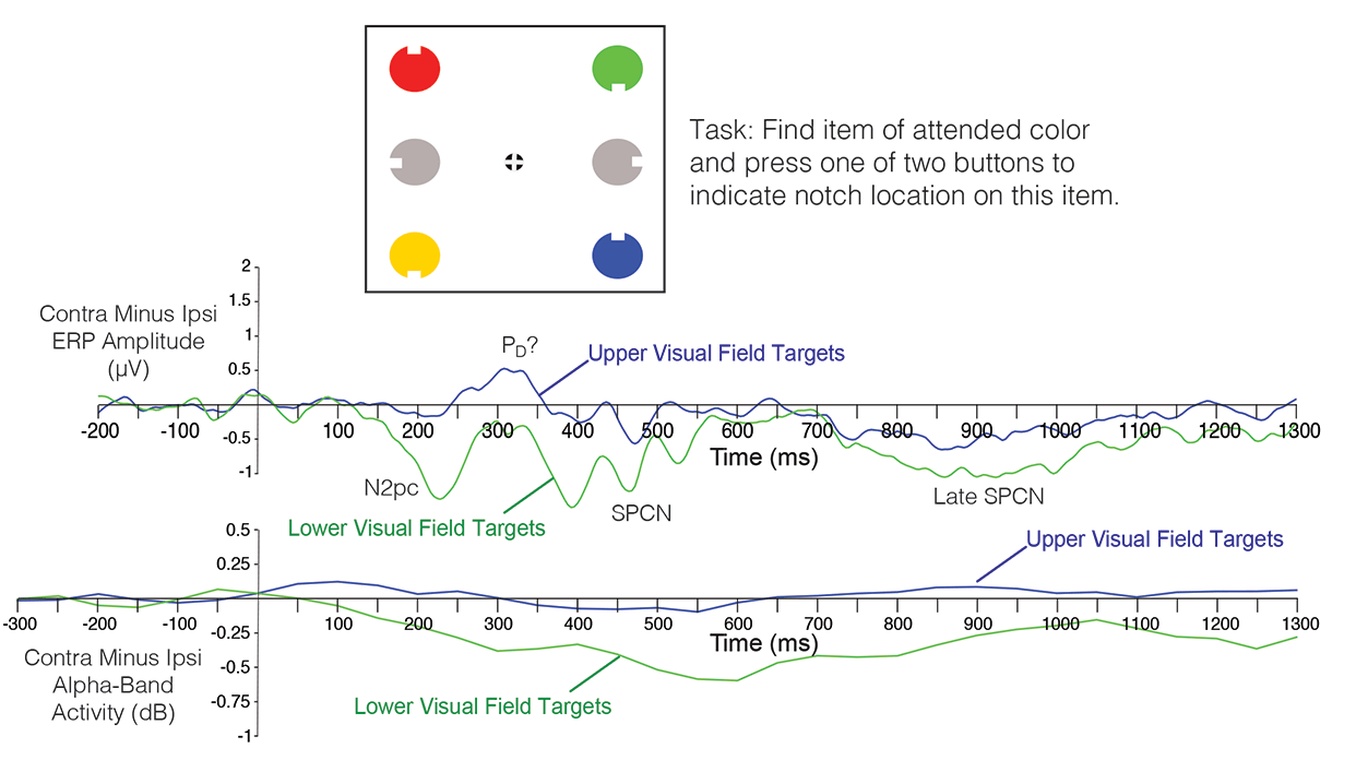
The study involved two experiments that we were designed to determine whether (a) lateralized alpha suppression would be triggered by a target in a visual search array, and (b) whether this effect could be experimentally dissociated from the N2pc component. The first experiment (shown in the figure below) used a fairly typical N2pc design. Subjects searched for an item of a specific color for a given block of trials. The target color appeared (unpredictably) at one of four locations. Previous research has shown that the N2pc component is primarily present for targets in the lower visual field, and we replicated this result (see ERP waveforms below). We also found that, although alpha-band activity was suppressed over both hemispheres following target presentation, this suppression was greater over the hemisphere contralateral to the target. Remarkably, like the N2pc component, the target-elicited lateralized alpha suppression (TELAS) occurred primarily for targets in the lower visual field. However, the time course of the TELAS was quite different from that of the N2pc. The scalp distribution of the TELAS also appeared to be more posterior than that of the N2pc component (although this was not formally compared).

The second experiment included a crowding manipulation, following up on a previous study in which the N2pc component was found to be largest when flanked by distractors that are at the edge of the crowding range, with a smaller N2pc when the distractors are so close that they prevent perception of the target shape (Bacigalupo & Luck, 2015). We replicated the previous result, but we saw a different pattern with the lateralized alpha suppression: The TELAS effect tended to increase progressively as the flanker distance decreased, with the largest magnitude for the most crowded displays. Thus, the TELAS effect appears to be related to difficulty or effort, whereas the N2pc component appears to be related to whether or not the target is successfully selected.

The bottom line is that visual search targets trigger both an N2pc component and a contralateral suppression of alpha-band EEG oscillations, especially when the targets are in the lower visual field, but the N2pc component and the TELAS effect can also be dissociated, reflecting different mechanisms of attention.

These results are also relevant for the question of whether lateralized alpha effects reflect an increase in alpha in the nontarget hemisphere to suppress information that would otherwise be processed by that hemisphere or, instead, a decrease in alpha in the target hemisphere to enhance the processing of target information. If the TELAS effect reflected processes related to distractors in the hemifield opposite to the target, then we would not expect it to be related to whether the target was in the upper or lower field or whether flankers were near the target item. Thus, the present results are consistent with a role of alpha suppression in increasing the processing of information from the target itself (see also a recent review paper by Josh Foster and Ed Awh).

One interesting side finding: The contralateral positivity that often follows the N2pc component (similar to a Pd component) was clearly present for the upper-field targets. It was difficult to know the amplitude of this component for the lower-field targets given the overlapping N2pc and SPCN components, but the upper-field targets clearly elicited a strong contralateral positivity with little or no N2pc. This provides an interesting dissociation between the post-N2pc contralateral positivity and the N2pc component.

New paper: Using ERPs and alpha oscillations to decode the direction of motion

Bae, G. Y., & Luck, S. J. (2018). Decoding motion direction using the topography of sustained ERPs and alpha oscillations. NeuroImage, 18: 242-255. https://doi.org/10.1016/j.neuroimage.2018.09.029

This is our second paper applying decoding methods to sustained ERPs and alpha-band EEG oscillations. The first one decoded which of 16 orientations was being maintained in working memory. In the new paper, we decoded which of 16 directions of motion was present in random dot kinematograms.

The paradigm is shown in the figure below. During a 1500-ms motion period, 25.6% or 51.2% of the dots moved coherently in one of 16 directions and the remainder moved randomly. After the motion ended, the subject adjusted a green line to match the direction of motion (which they could do quite precisely).

Motion Decoding.jpg

We asked whether we could decode (using machine learning) the precise direction of motion from the scalp distribution of the sustained voltage or alpha-band signal at each moment in time. Decoding the exact direction of motion is very challenging, and chance performance would be only 6.25% correct. During the motion period for the 51.2% coherence level, we were able to decode the direction of motion well above chance on the basis of the sustained ERP voltage (see the bottom right panel of the figure). However, as shown in the bottom left panel, we couldn’t decode the direction of motion on the basis of the alpha-band activity until the report period (during which time attention was presumably focused on the location of the green line).

When the coherence level was only 25.6% (and perception of coherent motion was much more difficult), we could not decode the actual direction of motion above chance. However, we were able to decode the direction of perceived motion (i.e., the direction that the subject reported at the end of the trial).

This study shows that (a) ERPs can be used to decode very subtle stimulus properties, and (b) sustained ERPs and alpha-band oscillations contain different information. In general, alpha-band activity appears to reflect the direction of spatial attention, whereas sustained ERPs contain information about both the direction of attention and the specific feature value being represented.

Why and how to email faculty prior to applying to graduate school

by Steve Luck and Lisa Oakes

[Note: Our experience is in Psychology and Neuroscience, but this probably applies to most other disciplines.]

It is now the season for students in the U.S. to begin the stressful, arduous, and sometimes expensive process of applying to PhD programs. One common piece of advice (that we give our own students) is to send emails to faculty at the institutions where you plan to apply. In this blog post, we explain why this is a good thing to do and how to do it. Some students find it very stressful to send these emails, and we hope that the “how to do it” section will make it less stressful. You don’t have to email the faculty, but it can be extremely helpful, and we strongly recommend that you do it.

In many programs (especially in Psychology), individual faculty play a huge role in determining which students are accepted into the PhD program. In these programs, students are essentially accepted into the lab of a specific faculty member, and the faculty are looking for students who have the knowledge, skills, and interests to succeed in their labs. This is often called the “apprenticeship model.”

In other programs (including most Neuroscience programs), admissions decisions are made by a committee, and individual faculty mentors play less of a role. Moreover, in most Neuroscience programs, grad students do lab rotations in the first year and do not commit to a specific lab until the second year. We’ll call this the “committee model.”

Why you should email the faculty

Although many students are accepted into graduate programs without emailing faculty prior to submitting applications to programs, there are many good reasons to do so. This can be especially useful for programs that use the apprenticeship model. First, you can find out whether they are actually planning to take new students. You don't want to waste money applying to a given program only to find out that the one faculty member of interest isn’t taking students this year (or is about to move to another university, take a job in industry, etc.). Information about this may be on the program’s web site or the faculty member’s web site, but web sites are often out of date, so it’s worth double-checking with an email.

Second, and perhaps most important, this email will get you “on the radar” of the faculty. Most PhD programs get hundreds of applicants, and faculty are much more likely to take a close look at your application if you’ve contacted them in advance.

Third, you might get other kinds of useful information. For example, a professor might write back saying something like “I’m not taking any new students, but we’ve just hired a new faculty member in the same area, and you might consider working with her.” Or, the professor might say something like “When you apply, make sure that you check the XXX box, which will make you eligible for a fellowship that is specifically for people from your background.” Or, if the professor accepts students through multiple programs (e.g., Psychology and Neuroscience), you might get information about which one to apply to or whether to apply to both programs. Both of us take students from multiple different graduate programs, and we often provide advice about which program is best for a given student (which can impact the likelihood of being accepted as well as the kinds of experiences the students will get).

If admissions are being done by a committee, an email can still be important. For example, decisions may take into account whether the most likely mentor(s) are interested in the student. Or you might find out that none of the faculty of interest in a given program are currently taking students for lab rotations. This could impact the likelihood that you get into a program, and it might make you less interested in a program if you know in advance that you won’t have the opportunity to do a rotation in that person’s lab. In addition, faculty members can (and will) contact the committee before decisions are made to ask them to take a close look at a particular student’s application, pointing out things that might not otherwise be obvious to them. Finally, the faculty are often involved in the interview process, and having already established a relationship will make the interview less intimidating and more productive.

How to email the faculty

Now that you are (we hope) convinced that you should contact the faculty, you have to muster up the courage to actually send that message, and you need to make sure that your message is effective. To address both of these issues, we’ll provide give you some general advice and then provide an email template that you can use as a starting point.

First, the general advice. Faculty are very busy, and they get a lot of emails that aren’t worth reading. Each of us gets many emails each year from prospective students, and we find that the right e-mail can pique our interest and make us look carefully at a student’s materials. On the other hand, generic e-mails that simply say “Are you accepting students” are likely to be ignored.

You need to make sure that your email is brief but has some key information to get their interest. We recommend a subject heading such as “Inquiry from potential graduate applicant.” For the main body of the email, your goals are to (a) introduce yourself, (b) inquire about whether they are taking students, (c) make it clear why you are interested in that particular faculty member, and (d) get any advice they might offer. Here’s an example:

Dear Dr. XXX,

I’m in my final year as a Cognitive Science major at XXXX, where I have been working in the lab of Dr. XXX XXX. My research has focused on attention and working memory using psychophysical and electrophysiological methods (see attached CV). I’m planning to apply to PhD programs this Fall, and I’m very interested in the possibility of working in your lab at UC Davis. I read your recent paper on XXX, and I found your approach to be very exciting.

I was hoping you might tell me whether you are planning to take new students in your lab in Fall 2019 [or: …whether you are planning to take rotation students in your lab…]. I’d also be interested in any other information or advice you have.

[Possibly add a few more lines here about your background and interests.]

Sincerely,
XXX XXXX

It’s useful to include some details about yourself—where you got or are getting your degree, what kind of research experience you’ve had, and/or what you’ve been doing since you graduated. Even if your research experience isn’t directly related to what you want to do, it’s a good idea to include at least a phrase about what you’ve been doing (e.g., “I did internships in a neuroscience lab working with rodents and a social psychology lab administering questionnaires”). But if this experience is very different from the intended mentor’s research, you need to make it clear that you’re planning to move in a different direction for your graduate work. We also pay more attention to emails from students who seem to know something about us. Mention a paper or a research project you saw on the professor’s website. You don’t need details; just show that you’ve done your homework and are truly interested in that individual.

It’s a good idea to attach a CV, even though there won’t be a lot on it. That’s a good place to provide some more details about your skills and experience. Also, if you have an excellent GPA or outstanding GRE scores, you can put them on your CV (although these would not go on a CV for most other purposes). Your goal is to stand out from the crowd, so you should include anything relevant that will be impressive (e.g., “3 years of intensive Python programming experience” but not “Familiarity with Excel and PowerPoint”). Don’t put posters, papers in progress, etc., in a section labeled “Publications” – that section should be reserved for papers/chapters that have actually been accepted for publication. You should include these things, but use more precise labels like “Manuscripts in Progress”, “Conference Presentations”, etc.

If you’re a member of an underrepresented/disadvantaged group, you can make this clear in your email or CV if you are comfortable doing so (although this may depend on your field). We recognize that this can sometimes be a sensitive issue, but there are often special funding opportunities for students with particular underrepresented identities, and most faculty are especially eager to recruit students from underrepresented/disadvantaged groups. Usually, this information can be provided indirectly (e.g., by listing scholarships you’ve received or programs that you’ve participated in, such as the McNair Scholars), but it can be helpful if you make this information explicit to your prospective faculty mentor and program. However, this can backfire if it’s not done just right, so we strongly recommend that you ask your current faculty mentor for advice about the best way to do this given your field and your specific situation.

No matter what your situation, we recommend having your faculty mentor(s) take a look at a draft of the email and your CV before you send them. Grad students and postdocs can also be helpful, but they may not really know what is appropriate given that they haven’t been on the receiving end of these emails.

Most importantly, don’t be afraid to send the email. The worst thing that will happen is that the faculty member doesn’t read it and doesn’t remember that you ever sent it. The best thing that can happen is that the e-mail leads to a conversation that helps you get accepted into the program of your dreams.

What to expect

Many faculty will simply not reply. In this case, no information is no information. There are many faculty who simply don’t read this kind of e-mail, and a “no reply” might mean you contacted one of those faculty. Of course, it’s also possible that they’re not interested in taking grad students and didn’t want to spend time replying. Or, it could mean that the message was caught by a spam filter, that they received 150 emails that day, etc. So, if you really want to work with that person, you may still want to apply.

You may get a brief response that says something like “Yes, I’m taking students, and I encourage you to apply” or “I’m always looking for qualified students.” This indicates that the faculty member will likely look at applications, and you don’t need to follow-up.

If you’re lucky, you may get a more detailed response that will lead to a series of email exchanges and perhaps an invitation to chat (usually on Skype or something similar). This will be more likely if you say something about what you’ve done and why you are interested in this lab. We know it may be stressful to actually talk to the faculty member, but isn’t that what you’re hoping to do in graduate school? Now is the time to get over that hurdle.

You may get a response like “I’m not taking new students this year” or “I probably won’t take new students this year” or “I’m not currently taking rotation students” (which is code for “don’t bother applying to work with me”). Or you might get something like “Given your background and interests, I don’t think you’d be a good fit for my lab.” Now you know not to waste your money applying to work with that person, so you’ve learned something valuable.

We’ve never heard of a student receiving a rude or unpleasant response. It may happen, but it would be extremely rare. So, you really don’t have much to lose by emailing faculty, and you have a lot to gain. It’s not 100% necessary, but it will likely increase your odds of getting into one of the programs you most want to attend.

New Paper: fMRI study of working memory capacity in schizophrenia

Hahn, B., Robinson, B. M., Leonard, C. J., Luck, S. J., & Gold, J. M. (2018). Posterior parietal cortex dysfunction is central to working memory storage and broad cognitive deficits in schizophrenia. The Journal of Neuroscience37, 8378–8387. https://doi.org/DOI: https://doi.org/10.1523/JNEUROSCI.0913-18.2018 https://doi.org/10.1523/JNEUROSCI.0913-18.2018.

In several behavioral studies using change detection/localization tasks, we have previously shown that people with schizophrenia (PSZ) exhibit large reductions in visual working memory storage capacity (Kmax). In one large study with 99 PSZ and 77 healthy control subjects (HCS), we found an effect size (Cohen's d) of 1.11, and the degree of Kmax reduction statistically accounted for approximately 40% of the reduction in overall cognitive ability exhibited by PSZ (as measured with the MATRICS Battery). Change detection tasks are much simpler than most working memory tasks, focus on storage rather than manipulation, and can be used across species. Thus, Kmax gives us a measure that is both neurobiologically tractable and strongly related to broad cognitive dysfunction.

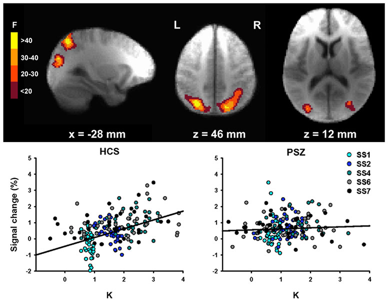
In our most recent work, led by Dr. Britta Hahn at the Maryland Psychiatric Research Center, we used fMRI to examine the neuroanatomical substrates of reduced Kmax in PSZ. We took advantage of an approach pioneered by Todd and Marois (2004, Nature), in which a whole-brain analysis is used to find clusters of voxels where the BOLD signal is related to the amount of information actually stored in working memory (K). As shown in the figure below, we found the same areas of posterior parietal cortex (PPC) that were observed by Todd and Marois.

In the left PPC, however, the K-dependent modulation of activity was reduced in PSZ relative to HCS. As shown in the scatterplots, the BOLD signal in this region was strongly related to the number of items being held in working memory (K) in HCS, but the function was essentially flat in PSZ. However, the overall level of activation was just as great in PSZ as in HCS (the Y intercept). The reduced slope was driven mainly by an overactivation in PSZ relative to HCS when relatively little information was being stored in memory. Moreover, the slope was strongly correlated with overall cognitive ability (again measured using the MATRICS Battery), and the degree of slope reduction statistically accounted for over 40% of the reduction in broad cognitive ability in PSZ.

One particularly interesting aspect of these results is that they point to posterior parietal cortex as a potential source of cognitive dysfunction in schizophrenia, whereas most research and theory has focused on prefrontal cortex. Studies with healthy young adults have consistently identified PPC as a major player in working memory capacity and in the ability to divide attention, both of which are strongly impaired in PSZ. We hope that our study motivates more research to examine the potential contribution of the PPC to cognitive dysfunction in schizophrenia.

Hahn fMRI Change Detection.jpg

New paper: What happens to an individual visual working memory representation when it is interrupted?

Bae, G.-Y., & Luck, S. J. (2018). What happens to an individual visual working memory representation when it is interrupted? British Journal of Psychology. https://onlinelibrary.wiley.com/doi/full/10.1111/bjop.12339

Working memory is often conceived as a buffer that holds information currently being operated upon. However, many studies have shown that it is possible to perform fairly complex tasks (e.g., visual search) that are interposed during the retention interval of a change detection task with minimal interference (especially load-dependent interference). One possible explanation is that the information from the change detection task can be held in some other form (e.g., activity-silent memory) while the interposed task is being performed.  If so, this might be expected to have subtle effects on the memory for the stimulus.

To test this, we had subjects perform a delayed estimation task, in which a single teardrop-shaped stimulus was held in memory and was reproduced at the end of the trial (see figure below). A single letter stimulus was presented during the delay period on some trials. We asked whether performing a very simple task with this interposed stimulus would cause a subtle disruption in the memory for the teardrop's orientation.  In some trial blocks, subjects simply ignored the interposed letter, and we found that it produced no disruption of the memory for the teardrop. In other trial blocks, subjects had to make a speeded response to the interposed letter, indicating whether it was a C or a D. Although this was a simple task, and only a single object was being maintained in working memory, the interposed stimulus caused the memory of the teardrop to become less precise and more categorical.

Thus, performing even a simple task on an interposed stimulus can disrupt a previously encoding working memory representation. The representation is not destroyed, but becomes less precise and more categorical, perhaps indicating that it had been offloaded into a different form of storage while the interposed task was being performed. Interestingly, we did not find this effect when an auditory interposed task was used, consistent with modality-specific representations.

Interruption_Paradigm.jpg

How to p-hack (and avoid p-hacking) in ERP research

Luck, S. J., & Gaspelin, N. (2017). How to Get Statistically Significant Effects in Any ERP Experiment (and Why You Shouldn’t)Psychophysiology, 54, 146-157.

How to get a significant effect.jpg

In this article, we show how ridiculously easy it is to find significant effects in ERP experiments by using the observed data to guide the selection of time windows and electrode sites. We also show that including multiple factors in your ANOVAs can dramatically increase the rate of false positives (Type I errors). We provide some suggestions for methods to avoid inflating the Type I error rate.

This paper was part of a special issue of Psychophysiology on Reproducibility edited by Emily Kappenman and Andreas Keil.

Some thoughts about the hypercompetitive academic job market

Many young academics are (justifiably) stressed out about their career prospects, ranging from the question of whether they will be able to get a tenure-track position to whether they will be able to publish in top-tier journals, get grants, get tenure, and do all of this without going insane.  Life in academia has been challenging for a long time, but the level of competition seems to be getting out of control. The goal of this piece is to discuss some ideas from population biology that might help explain the current state of hypercompetition and perhaps shed light on what kinds of changes might be helpful (or unhelpful).

Here’s the problem in a nutshell: if we want to provide a tenure-track faculty position for every new PhD who wants one, the number of available positions would need to increase exponentially with no limit.  This is shown in the graph below.  

Growth1.jpg

If we assume that a typical faculty member has a couple grad students at any given time, and most of them want jobs in academia, this faculty member will have a student who graduates and wants a faculty position approximately every three years.  As a result, we would need to create a new faculty position approximately every three years just to keep up with the students from a single current faculty member.  As if this wasn’t bad enough, these recent PhDs will then get their own grad students, who will also need faculty positions. This leads to an exponential growth in the number of positions needed to fill the demand.  

For example, if we have 1000 positions in a given field in the year 2018, we will need another 1000 positions in that field by the year 2021 to accommodate the new students who have received their PhDs by that time, leading to a total of 2000 positions to accommodate the demand that year.  The faculty in these 2000 positions will have students who will need another 2000 positions by the year 2024, leading to a total need for 4000 positions that year.  

If the number of positions kept increasing over time to fill the demand, we would need over a million positions by the year 2048!  This doesn’t account for retirements, etc., but those factors have a very small effect (unless we start forcing faculty to retire when they reach the age of 40 or some such thing).  There are various other assumptions here (e.g., a new PhD every 3 years), but virtually any realistic set of parameters will lead to an exponential or nearly-exponential growth function.

This is just like the exponential increase you might see in the size of a population of organisms, with a rate factor (r) that describes the rate of reproduction.  However, an exponential increase can happen only if reproduction is not capped by resource limitations.  Resource limitations lead to a maximum population size, which population biologists call K (for the “carrying capacity” of the environment).  When the exponential growth with rate r is combined with carrying capacity K, you get a logistic function.  This is shown in the picture below (from Khan Academy), which illustrates the growth rate of a population of organisms with no limit on the population size (the exponential function on the left) and with a limit at K (the logistic function on the right).

Population Growth.png

At early time points, the two functions are very similar: K doesn’t have much impact on the rate of growth in the logistic function early in time, and growth is mainly limited by r (the replication rate).  This is called “r-limited” growth.  However, later in time, the resource limitations start impacting the rate of growth in the logistic function, and the population size asymptotes at K.  This is called “K-limited” growth.  It’s much nicer to live in a period of r-limited growth, when there are plenty of resources.  When growth is K-limited, this means that the organisms in the population have so few resources that they die before they can reproduce, or are so hungry they can’t reproduce, or their offspring are so hungry they can’t survive, etc.  Not a very pleasant life.

In academia, r-limited growth means that jobs are plentiful, and the main limitations on growth are the number of students per lab and the rate at which they complete their degrees.  By contrast,  K-limited growth basically means that a faculty member needs to die or retire before a new PhD can get a position, and only a small fraction of new PhDs will ever get tenure-track jobs and start producing their own students.  This also means that the competition for tenure-track jobs and research grants will be fierce.  Sound familiar?

In the context of academia, K represents the maximum number of faculty positions that can be supported by the society.  The maximum number of faculty positions might increase gradually over time, as the overall population size increases or as a society becomes wealthier.  However, there is no way we can sustain an exponential growth forever (especially if that means we need over a million positions by 2048 in a field that has only a thousand positions in 2018).  

I think it’s pretty clear that we’re now in a K-limited period, where the number of positions is increasing far too slowly to keep up with the demand for positions from people getting PhDs.  When I was on the job market in the early 1990s, there were already more people with PhDs than available faculty positions.  However, the problem of an oversupply of PhDs was partially masked by an increase in the availability of postdoc positions.  Also, it was becoming more common for faculty at “second-tier” universities to conduct and publish research, so the actual number of positions that combined research and teaching was increasing.  But this balloon has stretched about as far as it can, and highly qualified young scholars are now having trouble getting the kind of position they are seeking (and we’re seeing 200+ applicants for a single position in our department).

In addition to a limited number of tenure-track faculty positions, we have a limited amount of grant money.  In some departments and subfields, getting a major grant is required for getting tenure.  Even if this isn’t a formal requirement, the resources provided by a grant (e.g., funding for grad students and postdocs) may be essential for an assistant professor to be sufficiently productive to receive tenure.  But an increase in grant funding without a commensurate increase in permanent positions can actually make things worse rather than better.  We saw that when the NIH budget was doubled between 1994 and 2003.  This led to an increase in funding for grad students and postdocs (leading to the balloon I mentioned earlier).  However, without an increase in the number of tenure-track faculty positions, there was nowhere for these people to go when they finished their training.  Their CVs were more impressive, but this just increased the expectations of search committees.  Also, a lot of the increased NIH funding was absorbed by senior faculty (like me) who now had 2, 3, or even 4 grants instead of just 1.  As usual, the rich got richer.

One might argue that competition is good, because it means that only the very best people get tenure-track positions and grants.  And I would be the first person to agree that competition can help inspire people to be as creative and productive as possible.  However, the current state of hypercompetition clearly has a dark side.  Some people write tons of grants, often with little thought, in the hopes of getting lucky.  This can lead to poorly-conceived projects, and it can leave people with little time to think about and actually conduct high-quality research.  And it can lead to p-hacking and other questionable research practices, or even outright fraud.  I think we’re way beyond the point at which the level of competition is beneficial.

Now let’s talk about solutions.  Should we increase the number of tenure-track faculty positions at research universities? I would argue that any solution of this nature is doomed to failure in the long run.  Increasing the number of position is an increase in K, and this just postpones the point at which the job market becomes saturated.  It would certainly help the people who are seeking a position now, but the problem will come back eventually. There just isn’t a way for the number of positions to increase exponentially forever.

We could also try to limit the number of students we accept into PhD programs.  This would be equivalent to decreasing r, the rate of “reproduction.”  However, for this to fully solve the problem, we would need the “birth rate” (number of new PhDs per year in a field) to equal the “death rate” (the number of retirements per year in the field).  Here’s another way to look at it: if the number of positions in a field remains constant, a given faculty member can expect to place only a single student in a tenure-track position over the course of the faculty member’s entire career.  Is it realistic to restrict the number of PhD students so that faculty can have only one student per career?  Or even one per decade?  Probably not.

I have only one realistic idea for a solution, which is to create more good positions for PhDs that don’t involve “reproduction” (i.e., training PhD students).  For example, if there were good positions outside of academia for a large number of PhDs, this would reduce the demand for tenure-track positions and decrease r, the rate of reproduction (assuming that there would be fewer people “spawning” new students as a result).  Tenure-track positions at teaching-oriented institutions have the same effect (as long as these institutions don’t decide to start granting PhDs).   I don’t think it’s realistic to increase the number of these teaching-oriented positions (except insofar as they increase with overall changes in population size).  However, in many areas of the mind and brain sciences, it appears that the availability of industry positions could increase substantially.  Indeed, we are already seeing many of our students and postdocs take jobs at places like Google and Netflix.

Many faculty in research-oriented universities think that success in graduate school means getting a tenure-track faculty position in a research-oriented university.  However, if I’m right that the current K-limited growth curve—and the associated hypercompetition—is a major problem, then we should place a much higher value on industry and teaching positions.  The availability of these positions will mean that we can continue to have lots of bright graduate students in our labs without dooming them to work as Uber drivers after they get their PhDs.  And teaching positions are intrinsically valuable: A great teacher can have a tremendous positive impact on thousands of students over the course of a career.

This doesn’t mean that we should focus our students’ training on teaching skills and data science skills, especially when these are not our own areas of expertise.  Excellent research training will be important for both industry positions and teaching-oriented faculty positions.  But we should encourage our students to think about getting some significant training in teaching and/or data science, which will be important even if they take positions in research-oriented universities.  And we should encourage some of our students to take industry internships and get teaching experience.  But mostly we should avoid sending the implicit or explicit message to our students that they are failures if they don’t pursue tenure-track research university positions.  If, as a field, we increase the number of our PhDs who take positions outside of research universities, this will make life better for everyone

VSS Poster: An illusion of opposite-direction motion

At the 2018 VSS meeting, Gi-Yeul Bae will be presenting a poster describing a motion illusion that, as far as we can tell, has never before been reported even though it has been "right under the noses" of many researchers.  As shown in the video below, this illusion arises in the standard "random dot kinematogram" displays that have been used to study motion perception for decades. In the standard task, the motion is either leftward or rightward. However, we allowed the dots to move in any direction in the 360° space, and the task was to report the exact direction at the end of the trial.

In the example video, the coherence level is 25% on some trials and 50% on others (i.e., on average, 25% or 50% of the dots move in one direction, and the other dots move randomly). A line appears at the end of the trial to indicate the direction of motion for that trial.  When you watch a given trial, try to guess the precise direction of motion.  If you are like most people, you will find that you guess a direction that is approximately 180° away from the true direction on a substantial fraction of trials.  You may even see the motion start in one direction and then reverse to the true direction. We recommend that you maximize the video and view it in HD.

In the controlled laboratory experiments described in our poster (which you can download here), we find that 180° errors are much more common than other errors. In addition, our studies suggest that this is a bona fide illusion, in which people confidently perceive a direction of motion that is the opposite of the true direction. If you know of any previous reports of this phenomenon, let us know!

New Paper: Combined Electrophysiological and Behavioral Evidence for the Suppression of Salient Distractors

Gaspelin, N., & Luck, S. J. (in press). Combined Electrophysiological and Behavioral Evidence for the Suppression of Salient Distractors. Journal of Cognitive Neuroscience.

Gaspelin-Pd.jpg

Evidence that people can suppress salient-but-irrelevant color singletons has come from ERP studies and from behavioral studies.  The ERP studies find that, under appropriate conditions, singleton distractors will elicit a Pd component, a putative electrophysiological signature of suppression (discovered by Hickey, Di Lollo, and McDonald, 2009). The behavioral studies show that processing at the location of the singleton is suppressed below the level of nonsingleton distractors (reviewed by Gaspelin & Luck, 2018).  Are these electrophysiological and behavioral signatures of suppression actually related?

In the present study, Nick Gaspelin and I used an experimental paradigm in which it was possible to assess both the ERP and behavioral measures of suppression.  First, we were able to demonstrate that suppression of the salient singleton distractors was present according to both measures.  Second, we found that these two measures were correlated: participants who should a larger Pd also showed greater behavioral suppression.  

Correlations like these can be difficult to find (and believe).  First, both the ERP and behavioral measures can be noisy, which attenuates the strength of the correlation and reduces power.  Second, spurious correlations are easy to find when there are a lot of possible variables to correlate and relatively small Ns.  A typical ERP session is about 3 hours, so it's difficult to have the kinds of Ns that one might like in a correlational study.  To address these problems, we conducted two experiments.  The first was not well powered to detect a correlation (in part because we had no idea how large the correlation would be, making it difficult to assess the power). We did find a correlation, but we were skeptical because of the small N.  We then used the results of the first experiment to design a second experiment that was optimized and powered to detect the correlation, using an a priori analysis approach developed from the first experiment.  This gave us much more confidence that the correlation was real.

Gaspelin-Pd-Exp3.jpg

We also included a third experiment that was suggested by the alway-thoughtful John McDonald. As you can see from the image above, the Pd component was quite early in Experiments 1 and 2. Some authors have argued that an early contralateral positivity of this nature is not actually the suppression-related Pd component but instead reflects an automatic salience detection process.  To address this possibility, we simply made the salient singleton the target.  If the early positivity reflects an automatic salience detection process, then it should be present whether the singleton is a distractor or a target.  However, if it reflects a task-dependent suppression mechanism, then it should be eliminated when subjects are trying to focus attention onto the singleton. We found that most of this early positivity was eliminated when the singleton was the target. The very earliest part (before 150 ms) was still present when the singleton was the target, but most of the effect was present only when the singleton was a to-be-ignored distractor. In other words, the positivity was not driven by salience per se, but occurred primarily when the task required suppressing the singleton.  This demonstrates very clearly that the suppression-related Pd component can appear as early as 150 ms when elicited by a highly salient (but irrelevant) singleton.

An old-school approach to science: "You've got to get yourself a phenomenon"

Given all the questions that have been raised about the reproducibility of scientific findings and the appropriateness of various statistical approaches, it would be easy to get the idea that science is impossible and we haven't learned a single thing about the mind and brain. But that's simply preposterous.  We've learned an amazing amount over the years.

In a previous blog post (and follow-up), I mentioned my graduate mentor's approach, which emphasized self-replication. In this post, I go back to my intellectual grandfather, Bob Galambos, whose discoveries you learned about as a child even if you didn't learn his name. I hope you find his advice useful. It's impractical in some areas of science, but it's what a lot of cognitive psychologists have done for decades and still do today (even though you can't easily tell from their journal articles).  I previously wrote about this in the second edition of An Introduction to the Event-Related Potential Technique, and the following is an excerpt. I am "recycling" this previous text because the relevance of this story goes way beyond ERP research.


Galambos.jpg

My graduate school mentor was Steve Hillyard, who inherited his lab from his own graduate school mentor, Bob Galambos (shown in the photo).  Dr. G (as we often called him) was still quite active after he retired.  He often came to our weekly lab meetings, and I had the opportunity to work on an experiment with him.  He was an amazing scientist who made really fundamental contributions to neuroscience.  For example, when he was a graduate student, he and fellow graduate student Donald Griffin provided the first convincing evidence that bats use echolocation to navigate.  He was also the first person to recognize that glia are not just passive support cells (and this recognition essentially cost him his job at the time).  You can read the details of his interesting life in his autobiography and in his NY Times obituary.

Bob was always a font of wisdom.  My favorite quote from him is this: “You’ve got to get yourself a phenomenon” (he pronounced phenomenon in a slightly funny way, like “pheeeenahmenahn”).  This short statement basically means that you need to start a program of research with a robust experimental effect that you can reliably measure.  Once you’ve figured out the instrumentation, experimental design, and analytic strategy that allows you to reliably measure the effect, then you can start using it to answer interesting scientific questions.  You can’t really answer any interesting questions about the mind or brain unless you have a “phenomenon” that provides an index of the process of interest.  And unless you can figure out how to record this phenomenon in a robust and reliable manner, you will have a hard time making real progress.  So, you need to find a nice phenomenon (like a new ERP component) and figure out the best ways to see that phenomenon clearly and reliably.  Then you will be ready to do some real science!


Why I've lost faith in p values, part 2

In a previous post, I gave some examples showing that null hypothesis statistical testing (NHST) doesn’t actually tell us what we want to know.  In practice, we want to know the probability that we are making a mistake when we conclude that an effect is present (i.e., we want to know the probability of a Type I error in the cases where p < .05).  A genetics paper calls this the False Positive Report Probability (FPRP)

However, when we use NHST, we instead know the probability that we will get a Type I error when the null hypothesis is true. In other words, when the null hypothesis is true, we have a 5% chance of finding p < .05.  But this 5% rate of false positives occurs only when the null hypothesis is actually true.  We don’t usually know that the null hypothesis is true, and if we knew it, we wouldn't bother doing the experiment and we wouldn’t need statistics.

In reality, we want to know the false positive rate (Type I error rate) in a mixture of experiments in which the null is sometimes true and sometimes false.  In other words, we want to know how often the null is true when p < .05.  In one of the examples shown in the previous post, this probability (FPRP) was about 9%, and in another it was 47%.  These examples differed in terms of statistical power (i.e., the probability that a real effect will be significant) and the probability that the alternative hypothesis is true [p(H1)].

The table below (Table 2 from the original post) shows the example with a 47% false positive rate.  In this example, we take a set of 1000 experiments in which the alternative hypothesis is true in only 10% of experiments and the statistical power is 0.5. The box in yellow shows the False Positive Report Probability (FPRP).  This is the probability that, in the set of experiments where we get a significant effect (p < .05), the null hypothesis is actually true.  In this example, we have a 47% FPRP.  In other words, nearly half of our “significant” effects are completely bogus.

Why I lost faith in p values-2.jpeg

The point of this example is not that any individual researcher actually has a 47% false positive rate.  The point is that NHST doesn’t actually guarantee that our false positive rate is 5% (even when we assume there is no p-hacking, etc.).  The actual false positive rate is unknown in real research, and it might be quite high for some types of studies.  As a result, it is difficult to see why we should ever care about p values or use NHST.

In this follow-up post, I’d like to address some comments/questions I’ve gotten over social media and from the grad students and postdocs in my lab.  I hope this clarifies some key aspects of the previous post.  Here I will focus on 4 issues:

  1. What happens with other combinations of statistical power and p(H1)? Can we solve this problem by increasing our statistical power?

  2. Why use examples with 1000 experiments?

  3. What happens when power and p(H1) vary across experiments?

  4. What should we do about this problem?

If you don’t have time to read the whole blog, here are four take-home messages:

  • Even when power is high, the false positive rate is still very high when H1 is unlikely to be true. We can't "power our way" out of this problem.

  • However, when power is high (e.g., .9) and the hypothesis being tested is reasonably plausible, the actual rate of false positives is around 5%, so NHST may be reasonable in this situation

  • In most studies, we’re either not in this situation or we don’t know whether we’re in this situation, so NHST is still problematic in practice

  • The more surprising an effect, the more important it is to replicate

1. What happens with other combinations of statistical power and p(H1)? Can we solve this problem by increasing our statistical power?

My grad students and postdocs wanted to see the false positive rate for a broader set of conditions, so I made a little Excel spreadsheet (which you can download here).  This spreadsheet can calculate the false positive rate (FPRP) for any combination of statistical power and p(H1).  This spreadsheet also produces the following graph, which shows 100 different combinations of these two factors.

Why I lost faith in p values-3.jpg

This figure shows the probability that you will falsely reject the null hypothesis (make a Type I error) given that you find a significant effect (p < .05) for a given combination of statistical power and likelihood that the alternative hypothesis is true.  For example, if you look at the point where power = .5 and p(H1) = .1, you will see that the probability is .47.  This is the example shown in the table above.  Several interesting questions can be answered by looking at the pattern of false positive rates in this figure.

Can we solve this problem by increasing our statistical power? Take a look at the cases at the far right of the figure, where power = 1.  Because power = 1, you have a 100% chance of finding a significant result if H1 is actually true.  But even with 100% power, you have a fairly high chance of a Type I error if p(H1) is low.  For example, if some of your experiments test really risky hypotheses, in which p(H1) is only 10%, you will have a false positive rate of over 30% in these experiments even if you have incredibly high power (e.g., because you have 1,000,000 participants in your study).  The Type I error rate declines as power increases, so more power is a good thing.  But we can’t “power our way out of this problem” when the probability of H1 is low.

Is the FPRP ever <= .05? The figure shows that we do have a false positive rate of <= .05 under some conditions.  Specifically, when the alternative hypothesis is very likely to be true (e.g., p(H1) >= .9), our false positive rate is <= .05 no matter whether we have low or high power.  When would p(H1) actually be this high?  This might happen when your study includes a factor that is already known to have an effect (usually combined with some other factor).  For example, imagine that you want to know if the Stroop effect is bigger in Group A than in Group B.  This could be examined in a 2 x 2 design, with factors of Stroop compatibility (compatible versus incompatible) and Group (A versus B).  p(H1) for the main effect of Stroop compatibility is nearly 1.0.  In other words, this effect has been so consistently observed that you can be nearly certain that it is present in your experiment (whether or not it is actually statistically significant).  [H1 for this effect could be false if you’ve made a programming error or created an unusual compatibility manipulation, so p(H1) might be only 0.98 instead of 1.0.]  Because p(H1) is so high, it is incredibly unlikely that H1 is false and that you nonetheless found a significant main effect of compatibility (which is what it means to have a false positive in this context).  Cases where p(H1) is very high are not usually interesting — you don’t do an experiment like this to see if there is a Stroop effect; you do it to see if this effect differs across groups.

A more interesting case is when H1 is moderately likely to be true (e.g., p(H1) = .5) and our power is high (e.g., .9).  In this case, our false positive rate is pretty close to .05.  This is good news for NHST: As long as we are testing hypotheses that are reasonably plausible, and our power is high, our false positive rate is only around 5%. 

This is the “sweet spot” for using NHST.  And this probably characterizes a lot of research in some areas of psychology and neuroscience.  Perhaps this is why the rate of replication for experiments in cognitive psychology is fairly reasonable (especially given that real effects may fail to replicate for a variety of reasons).  Of course, the problem is that we can only guess the power of a given experiment and we really don’t know the probability that the alternative hypothesis is true.  This makes it difficult for us to use NHST to control the probability that our statistically significant effects are bogus (null). In other words, although NHST works well for this particular situation, we never know whether we’re actually in this situation.

2. Why use examples with 1000 experiments?

The example shown in Table 2 may seem odd, because it shows what we would expect in a set of 1000 experiments.  Why talk about 1000 experiments?  Why not talk about what happens with a single experiment? Similarly, the Figure shows "probabilities" of false positives, but a hypothesis is either right or wrong. Why talk about probabilities?

The answer to these questions is that p values are useful only in telling you the long-run likelihood of making a Type I error in a large set of experiments.  P values do not represent the probability of a Type I error in a given experiment.  (This point has been made many times before, but it's worth repeating.)

NHST is a heuristic that aims to minimize the proportion of experiments in which we make a Type I error (falsely reject the null hypothesis).  So, the only way to talk about p values is to talk about what happens in a large set of experiments.  This can be the set of experiments that are submitted to a given journal, the set of experiments that use a particular method, the set of experiments that you run in your lifetime, the set of experiments you read about in a particular journal, the set of experiments on a given topic, etc.  For any of these classes of studies, NHST is designed to give us a heuristic for minimizing the proportion of false positives (Type I errors) across a large number of experiments.  My examples use 1000 experiments simply because this is a reasonably large, round number.

We’d like the probability of a Type I error in any given set of experiments to be ~5%, but this is not what NHST actually gives us.  NHST guarantees a 5% error rate only in the experiments in which the null hypothesis is actually true.  But this is not what we want to know.  We want to know how often we’ll have a false positive across a set of experiments in which the null is sometimes true and sometimes false.  And we mainly care about our error rate when we find a significant effect (because these are the effects that, in reality, we will be able to publish).  In other words, we want to know the probability that the null hypothesis is true in the set of experiments in which we get a significant effect [which we can represent as a conditional probability: p(null | significant effect); this is the FPRP].  Instead, NHST gives us the probability that we will get a significant effect when the null is true [p(significant effect | null)]. These seem like they’re very similar, but the example above shows that they can be wildly different.  In this example, the probability that we care about [p(null | significant effect)] is .47, whereas the probability that NHST gives us [p(significant effect | null)] is .05.

3. What happens when power and p(H1) vary across experiments?

For each of the individual points shown in the figure above, we have a fixed and known statistical power along with a fixed and known probability that the alternative hypothesis is true (p(H1).  However, we don’t actually know these values in real research.  We might have a guess about statistical power (but only a guess because power calculations require knowing the true effect size, which we never know with any certainty).  We don’t usually have any basis (other than intuition) for knowing the probability that the alternative hypothesis is true in a given set of experiments.  So, why should we care about examples with a specific level of power and a specific p(H1)?

Here’s one reason: Without knowing these, we can’t know the actual probability of a false positive (the FPRP, p(null is true | significant effect)).  As a result, unless you know your power and p(H1), you don’t know what false positive rate to expect.  And if you don’t know what false positive rate to expect, what’s the point of using NHST?  So, if you find it strange that we are assuming a specific power and p(H1) in these examples, then you should find it strange that we regularly use NHST (because NHST doesn’t tell us the actual false positive rate unless we know these things).

The purpose of examples like the one shown above is that they can tell you what might happen for specific classes of experiments.  For example, when you see a paper in which the result seems counterintuitive (i.e., unlikely to be true given everything you know), this experiment falls into a class in which p(H1) is low and the probability of a false positive is therefore high.  And if you can see that the data are noisy, then the study probably has low power, and this also tends to increase the probability of a false positive.  So, even though you never know the actual power and p(H1), you can probably make reasonable guesses in some cases.

Most real research consists of a mixture of different power levels and p(H1) levels.  This makes it even harder to know the effective false positive rate, which is one more reason to be skeptical of NHST.

4. What should we do about this problem?

I ended the previous post with the advice that my graduate advisor, Steve Hillyard, liked to give: Replication is the best statistic.  Here’s something else he told me on multiple occasions: The more important a result is, the more important it is for you to replicate it before publishing it.  Given the false positive rates shown in the figure above, I would like to rephrase this as: The more surprising a result is, the more important it is to replicate the result before believing it.

In practice, a result can be surprising for at least two different reasons.  First, it can be surprising because the effect is unlikely to be true.  In other words, p(H1) is low.  A widely discussed example of this is the hypothesis that people have extrasensory perception.

However, a result can also seem surprising because it’s hard to believe that our methods are sensitive enough to detect it.  This is essentially saying that the power is low.  For example, consider the hypothesis that breast-fed babies grow up to have higher IQs than bottle-fed babies.  Personally, I think this hypothesis is likely to be true.  However, the effect is likely to be small, there are many other factors that affect IQ, and there are many potential confounds that would need to be ruled out. As a result, it seems unlikely that this effect could be detected in a well-controlled study with a realistic number of participants. 

For both of these classes of surprising results (i.e., low p(H1) and low power), the false positive rate is high.  So, when a statistically significant result seems surprising for either reason, you shouldn’t believe it until you see a replication (and preferably a preregistered replication).  Replications are easy in some areas of research, and you should expect to see replications reported within a given paper in these areas (but see this blog post by Uli Schimmackfor reasons to be skeptical when the p value for every replication is barely below .05). Replications are much more difficult in other areas, but you should still be cautious about surprising or low-powered results in those areas.

Electrophysiological Evidence for Spatial Hyperfocusing in Schizophrenia

Kreither, J., Lopez-Calderon, J., Leonard, C. J., Robinson, B. M., Ruffle, A., Hahn, B., Gold, J. M., & Luck, S. J. (2017). Electrophysiological Evidence for Spatial Hyperfocusing in SchizophreniaThe Journal of Neuroscience, 37, 3813-3823.

Double Oddball P3 Bar Graph.jpg

This paper from last spring describes new evidence for our hyperfocusing theory of cognitive dysfunction in schizophrenia.  Remarkably, we found that people with schizophrenia were actually better able to focus centrally and filter peripheral distractors than were control subjects. Under the right conditions, we even observed a (slightly) larger P3 wave in patients than in controls.